We all know that a picture is worth a thousand words. But sometimes a picture can be worth a thousand customers (or more) for your Shopify store.
We’re not talking about the product images you use or the graphics on your store’s theme. We’re talking about the visual aspect of your gift cards.
As you probably know, Your gift cards are your brand’s ambassadors. They are quite literally the face of your store on every channel: online, in your brick and mortar locations and on social media. With their very nature entailing them being sent from one person to another, they have a high degree of virality. exposing your store to new potential customers all the time.
Are you taking advantage of all those first impressions? This is your chance to understand the power that visuals bring to your gift cards and learn how to use it to get ahead.
Let’s go!
Make Your Gift Cards Say “You” All Over
Even if your gift card is a digital product that no one ever holds in their hand, it needs to look like something when you display it on your website. That “something” could be a white card with your logo on it. But if you do that, you’ll be missing out on a big opportunity.
Instead, you should use your gift card to appeal to the senses of your customer and their recipient.
For instance imagine a gift card sales page where the images, text and whole delivery experience express the sensation of heavenly chocolate truffles melting in your mouth.
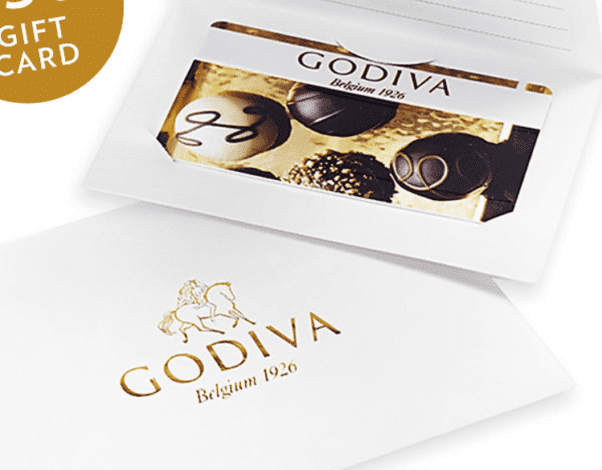

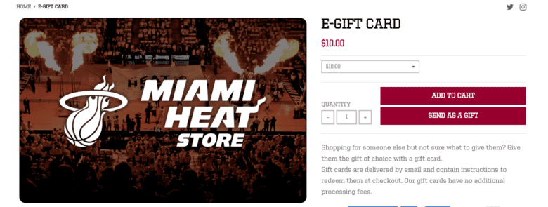
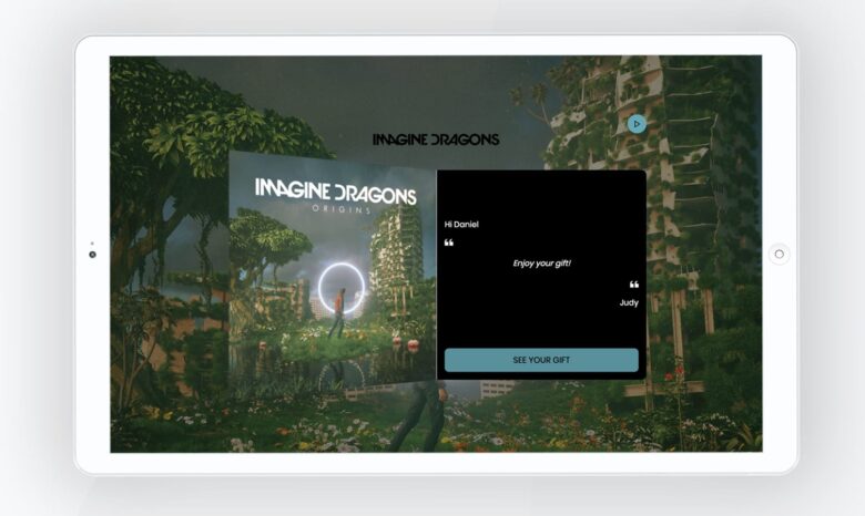
How to put this into action
Spend about 15 minutes getting into the head of your ideal customer. When Suzie Customer experiences your product or service: what experience does it give her? What emotions does it evoke? What pictures does it bring up in her mind?
In addition, you might want to brainstorm with staff members if you have them, or with a few of your best customers.
Now spend another 15 minutes thinking about the graphics and text. What would give over that experience and its accompanying feelings?
If you have a few different ideas, you can test out a few different designs. You should set a time to see which one gets the most traction. We wouldn’t recommend testing more than about four at a time, or you may end up with customers stuck in analysis paralysis.
Give Your Gift Cards Some Holiday Spirit
You’re Mother’s Day shopper debating between gift cards from two different brands. Your mom loves both brands and you know she would be thrilled with a gift card from either one. Then you look at the design on the gift card. One gift card shows the brand name and logo on a white background. And the other is pretty much the same however the background is totally different – a kid holding a bouquet of roses with a tag that says: “For the Best Mom Ever.”
Which one are you going to choose? No brainer, right?

Gift cards that are visually customized for specific occasions attract givers and impress recipients. With digital gift cards, you don’t have to invest resources in printing hundreds of holiday-themed gift cards that may or may not get used. One graphic image of your gift card and you’re good to go!
By using a free photo sites like Shopify’s or the mountain of other options available, you can save on graphic design costs.
For instance, a search for “Christmas” will turn up gorgeous images available to use for commercial purposes without charge or attribution.
You can also offer special designs for common occasions, like a confetti-filled “Happy Birthday!” card design.
In the case of Bath & Body Works they have put a lot of effort into making sure they have a range of gift card designs for different holidays, occasions and even sentiments.
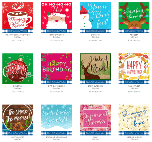
This is only half of the available designs. With 23 options in all, they might be violating the “eliminate analysis paralysis” principle.
To be fair, if you’re looking for a Christmas gift, you’re not likely to be “paralyzed” by the birthday, thank you or bridal shower options. But the existence of all those options, all in the same place, does create a lot of noise for your customers to tune out.
Thing to Keep in Mind
- Don’t give too many options for any one holiday or occasion. Analysis paralysis may kick in and prevent your customer from selecting any of them.
- remove options that aren’t timely. You don’t need to have your Hanukkah design show as an option in June.
- If you have different occasion gift cards, you might want to have some kind of filter where they can choose to see only: “holiday gift cards”, “birthday gift cards.”
Let the Buyer Customize their Gift Cards
Let’s take this a step further. What if you enabled your gift card buyer to customize the look of the gift card? The costs of such physical gift cards would be prohibitive, but digitally, it’s a snap.
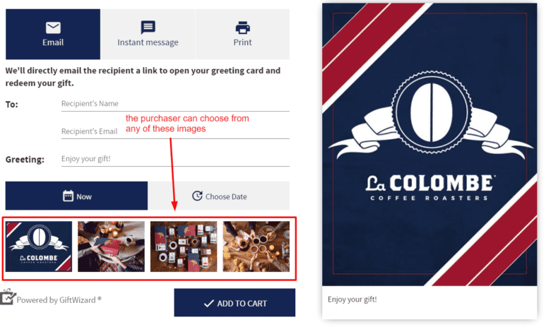
Boutique coffee roaster La Colombe already gives several different image options for their e-gift card or gift card announcement. What if they would let you upload your own image?
Can you imagine what an amazing gift it would be for a coffee lover to receive a La Colombe gift card featuring a picture if herself drinking coffee?
The Eyes Have It
We’re visual creatures. The way something looks makes a tremendous difference. Use the power of the visual wisely to help your gift cards make a great first impression. Let them be the most effective brand ambassadors they can be.
Make sure your gift cards are:
- beautiful
- branded
- memorable
- holiday-specific
Put the power of personalization in your customers’ hands.
And then watch the results in your gift card sales. Watch, too, as your gift cards draw ever greater numbers of customers to your site.
You’ll have to see it to believe it.
